BRAND IDENTITY · VISUAL SYSTEMS
IHOP Re-Brand
A familiar brand, refreshed.
Evolving an iconic identity while preserving its warmth and recognition.
Client
IHOP
Scope
Brand identity, visual language & graphic standards
My contribution
Design contribution within a multidisciplinary team
01
Familiarity meets a fresh perspective.
The project reimagined IHOP’s identity while retaining the familiarity that has made it a longstanding presence in the restaurant industry.
The opportunity was to modernize the brand without losing its warmth, accessibility, or recognition.
02
One cohesive visual system.
As part of a multidisciplinary team, I contributed to the evolution of the logo, visual language, and graphic standards.
Typography, graphics, color applications, and guidelines create a consistent framework across environments, digital platforms, and marketing touchpoints.




IHOP / Brand extensions
One identity.
A family of experiences.
Service formats
Programs & campaigns
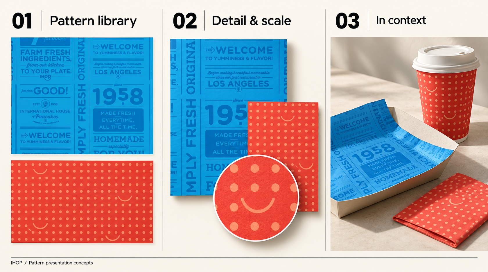
IHOP / Pattern system
A little history.
A lot of personality.
IHOP / Brand guidelines
A system built
for consistency.
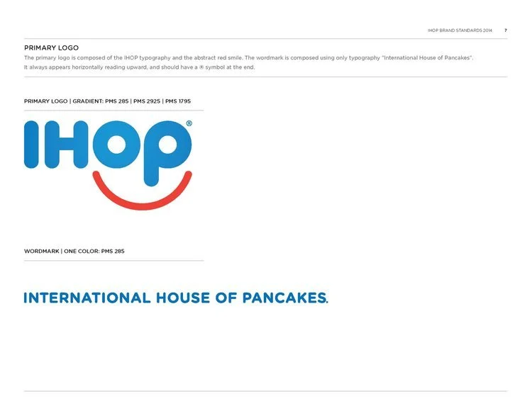
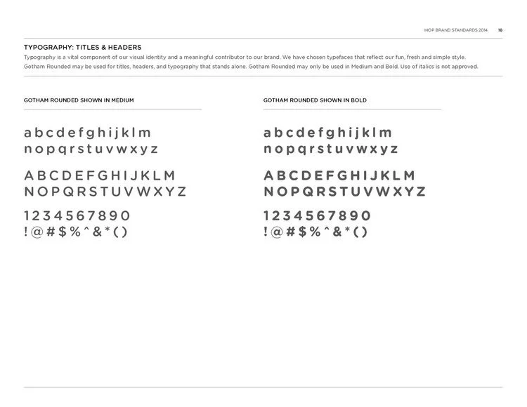
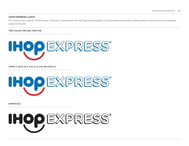
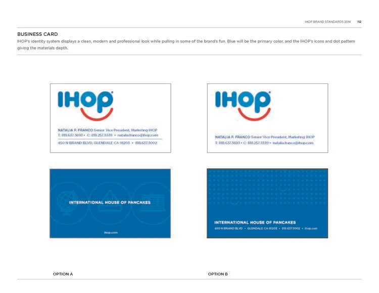
Selected pages from the brand standards, bringing the identity, color and visual language into one consistent system. Select a page to view it at full size.