WORKPLACE · SIGNAGE & WAYFINDING
7500
Bethesda, Maryland
A renewed identity, from arrival to everyday experience.
Client
7500 · In-Rel Properties
Scope
Environmental graphics, wayfinding & branded environments
My contribution
Creative direction · Project management · Design
01
A renewed workplace identity
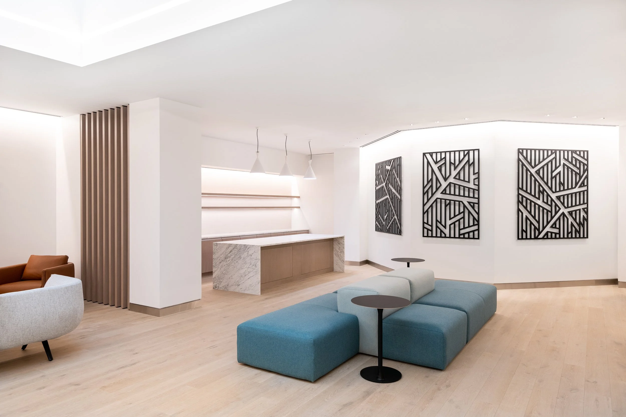
Originally built in 1984, 7500 Old Georgetown Road was repositioned for a new generation of workplace use in downtown Bethesda. FOX Architects’ renovation reimagined the building’s arrival and shared amenities, from an expanded lobby and renewed plaza to a Metro-level lounge and a conference and fitness floor.
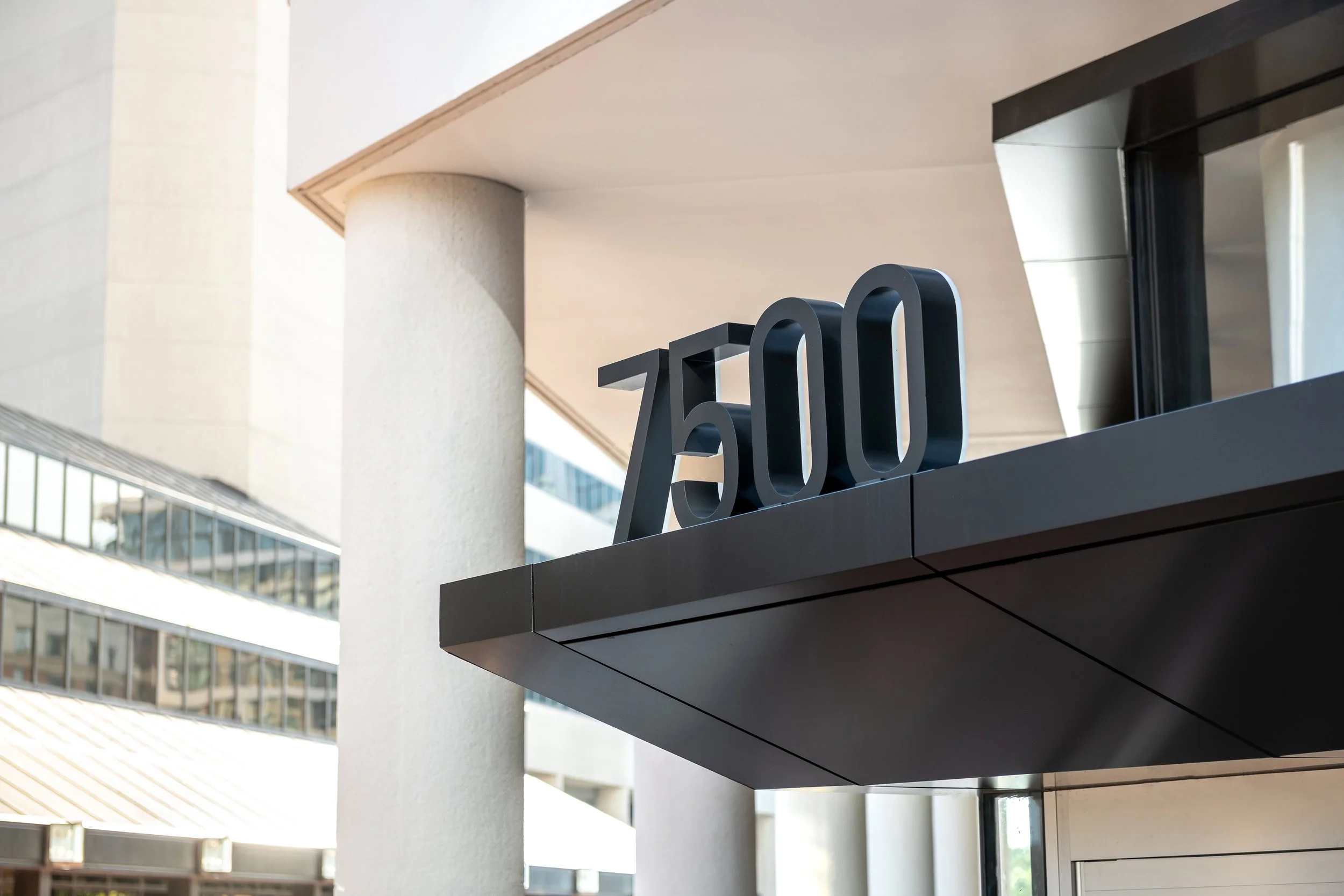
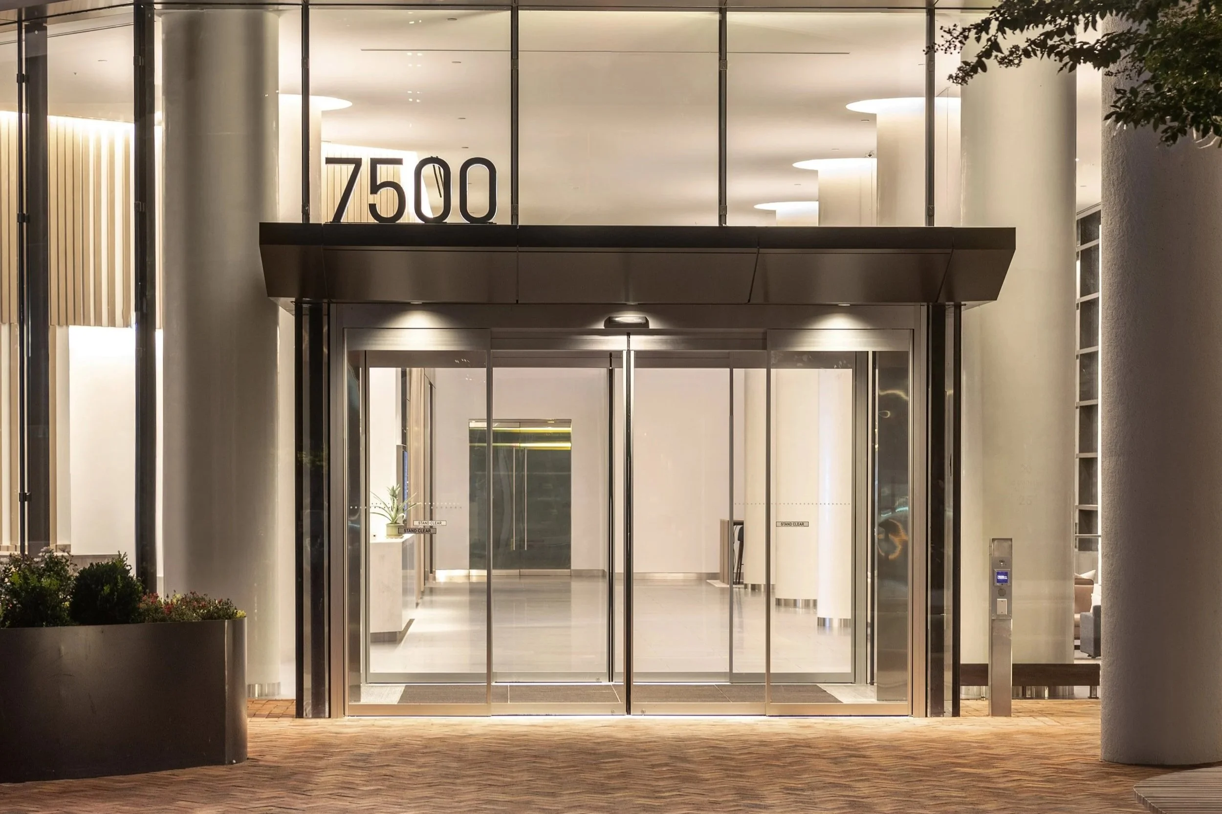
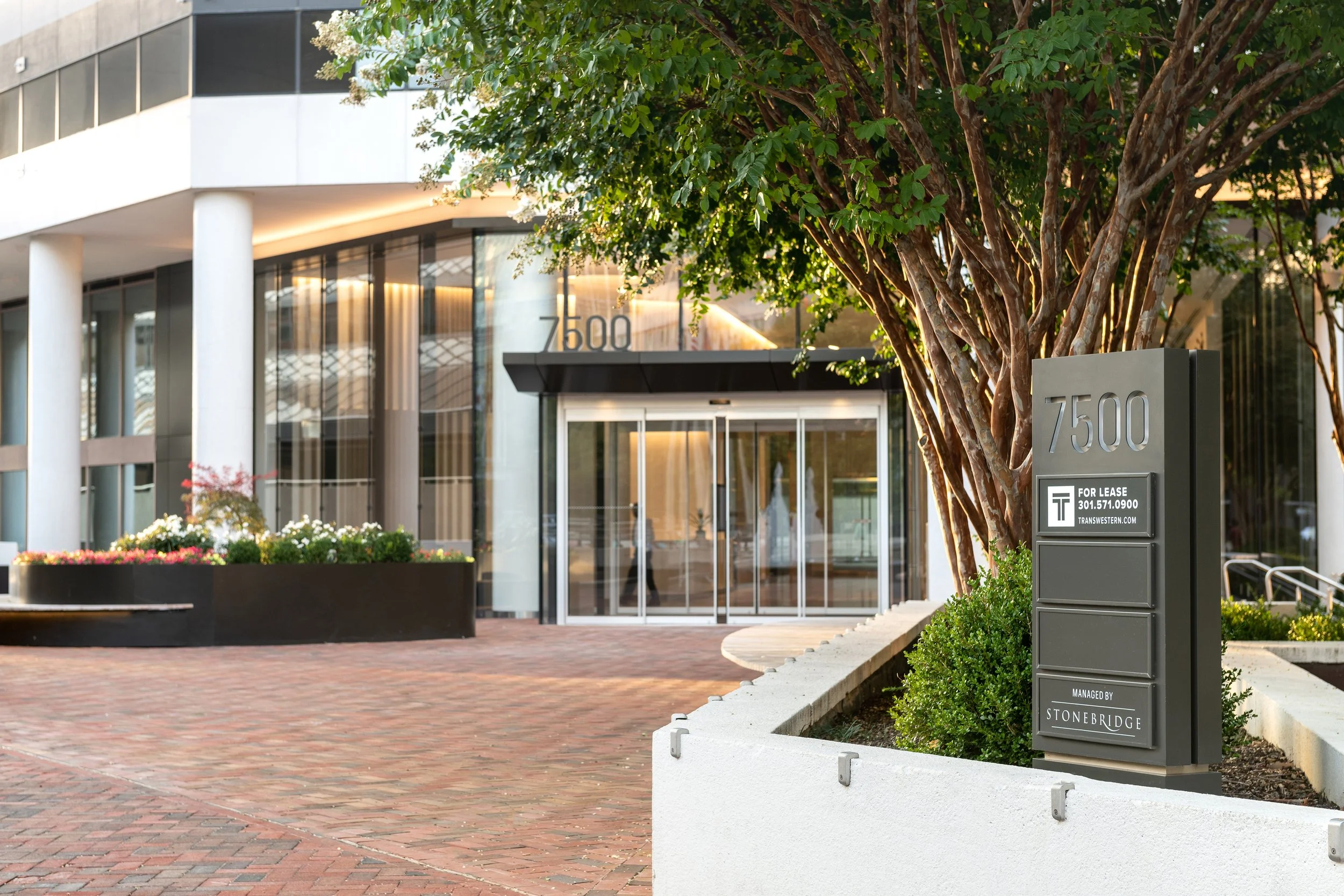
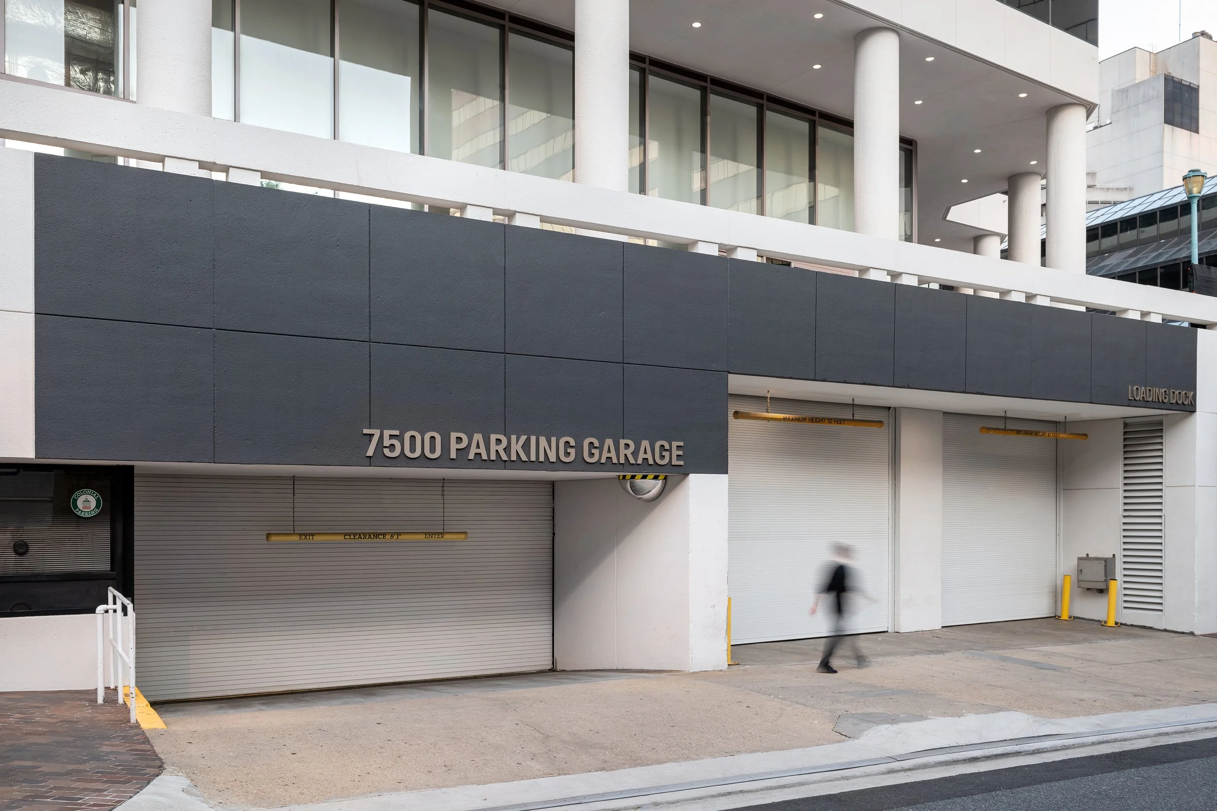
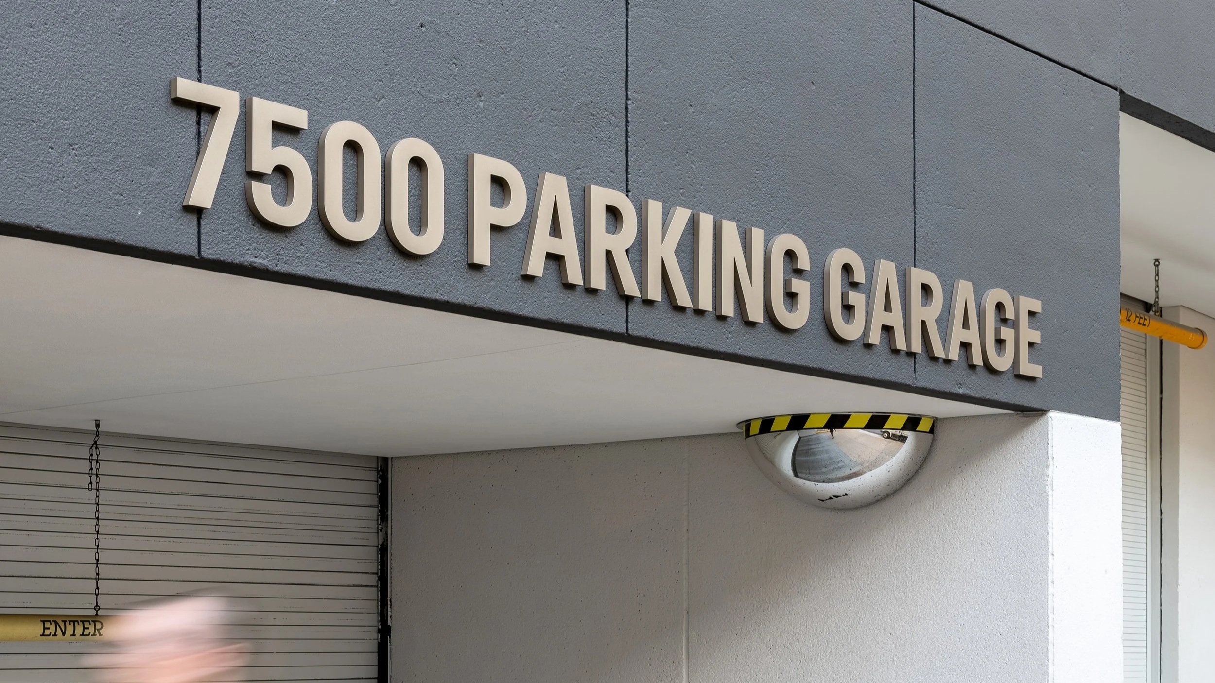
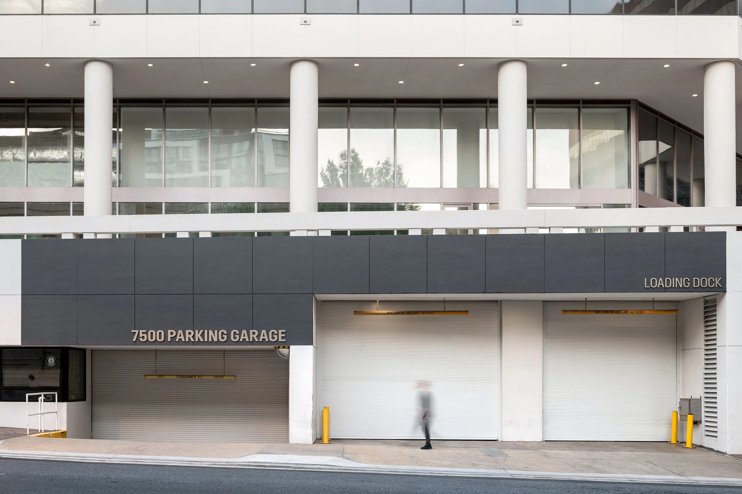
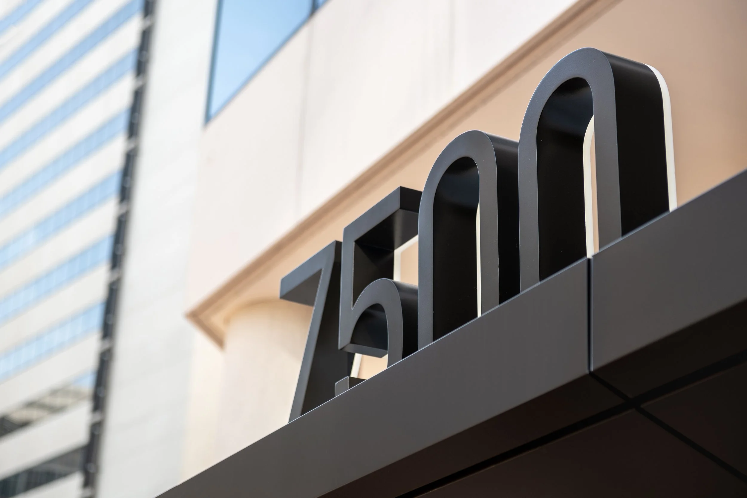
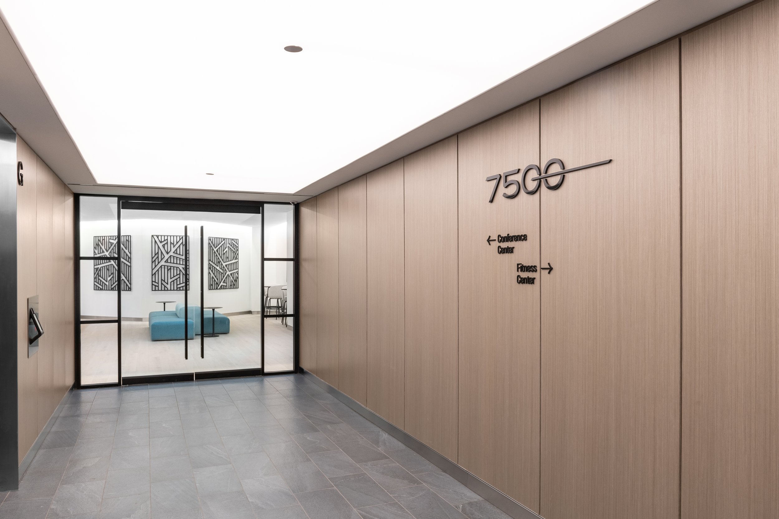
Within this transformation, environmental graphics and wayfinding connect the building’s public spaces and everyday destinations. Exterior identification establishes a recognizable arrival, while interior signage carries the identity through the lobby and amenity areas. The result is a consistent visual thread that helps tenants and visitors understand the building as a whole.
02
Materials as a visual language
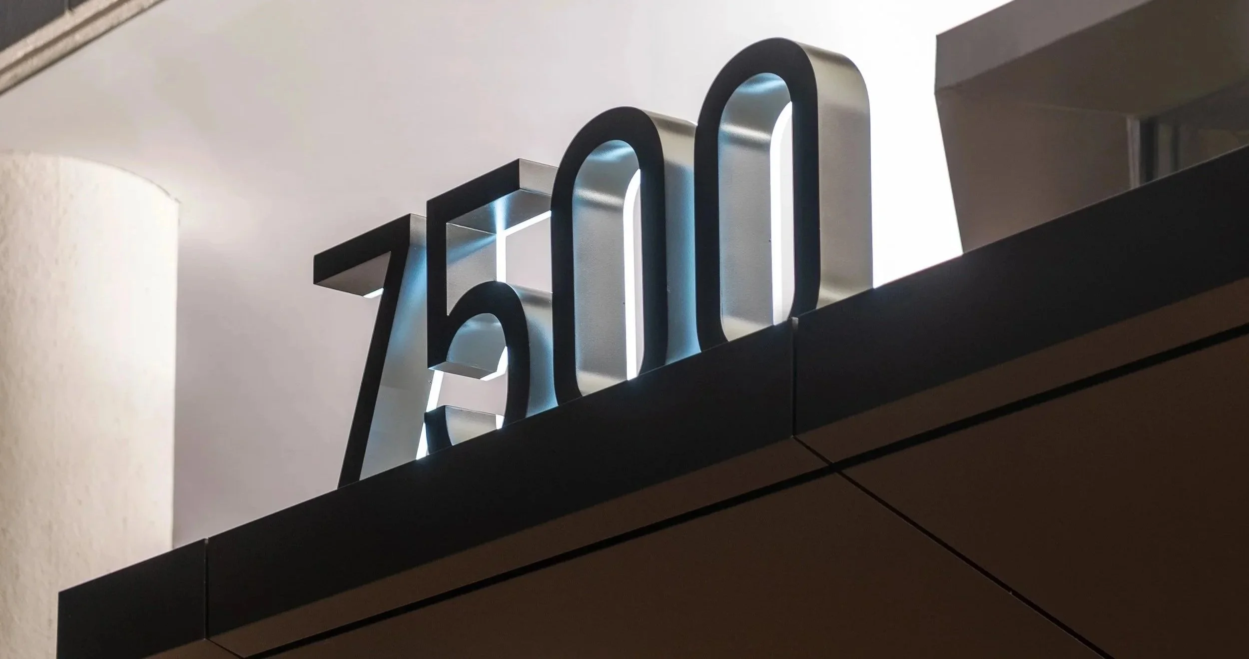
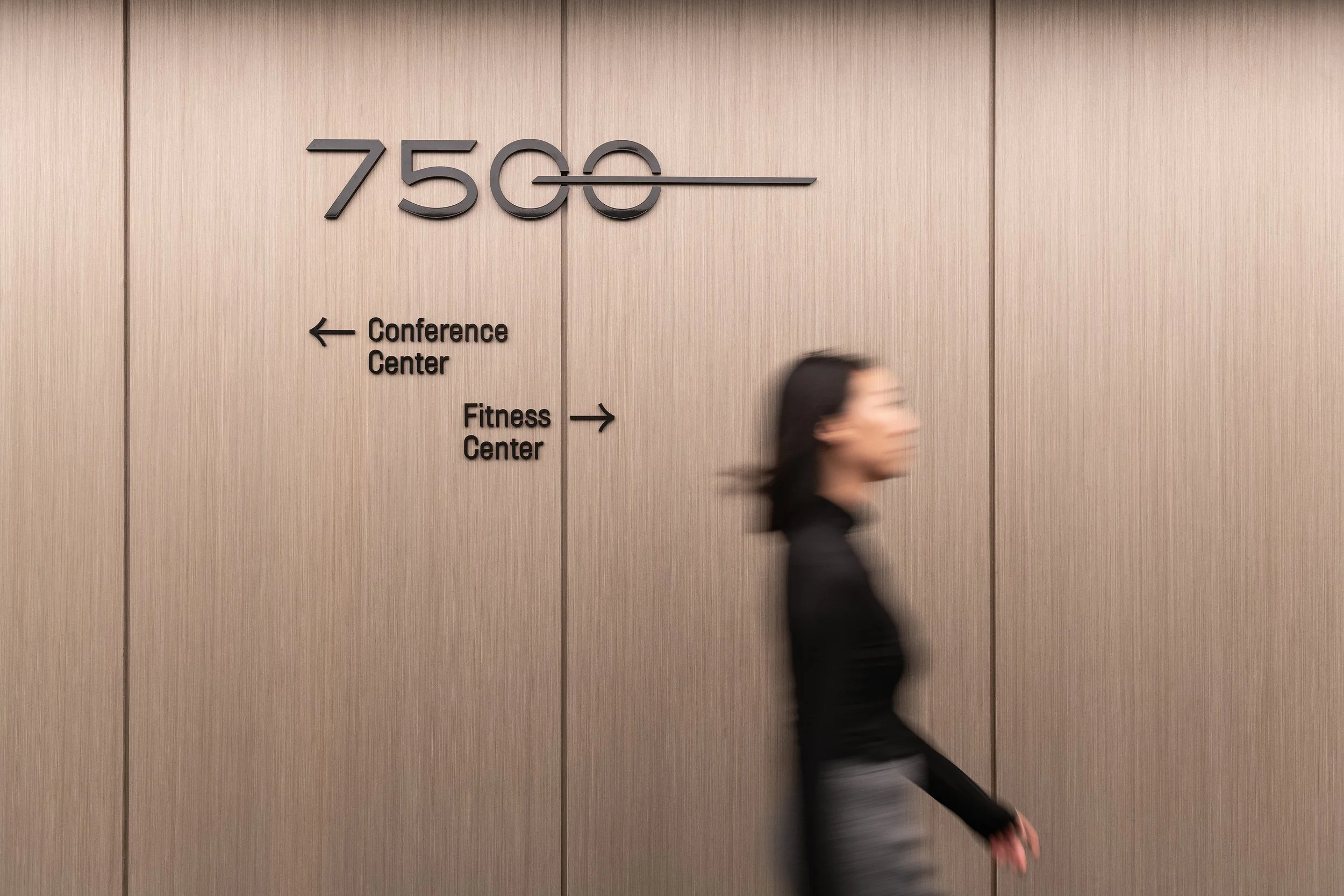
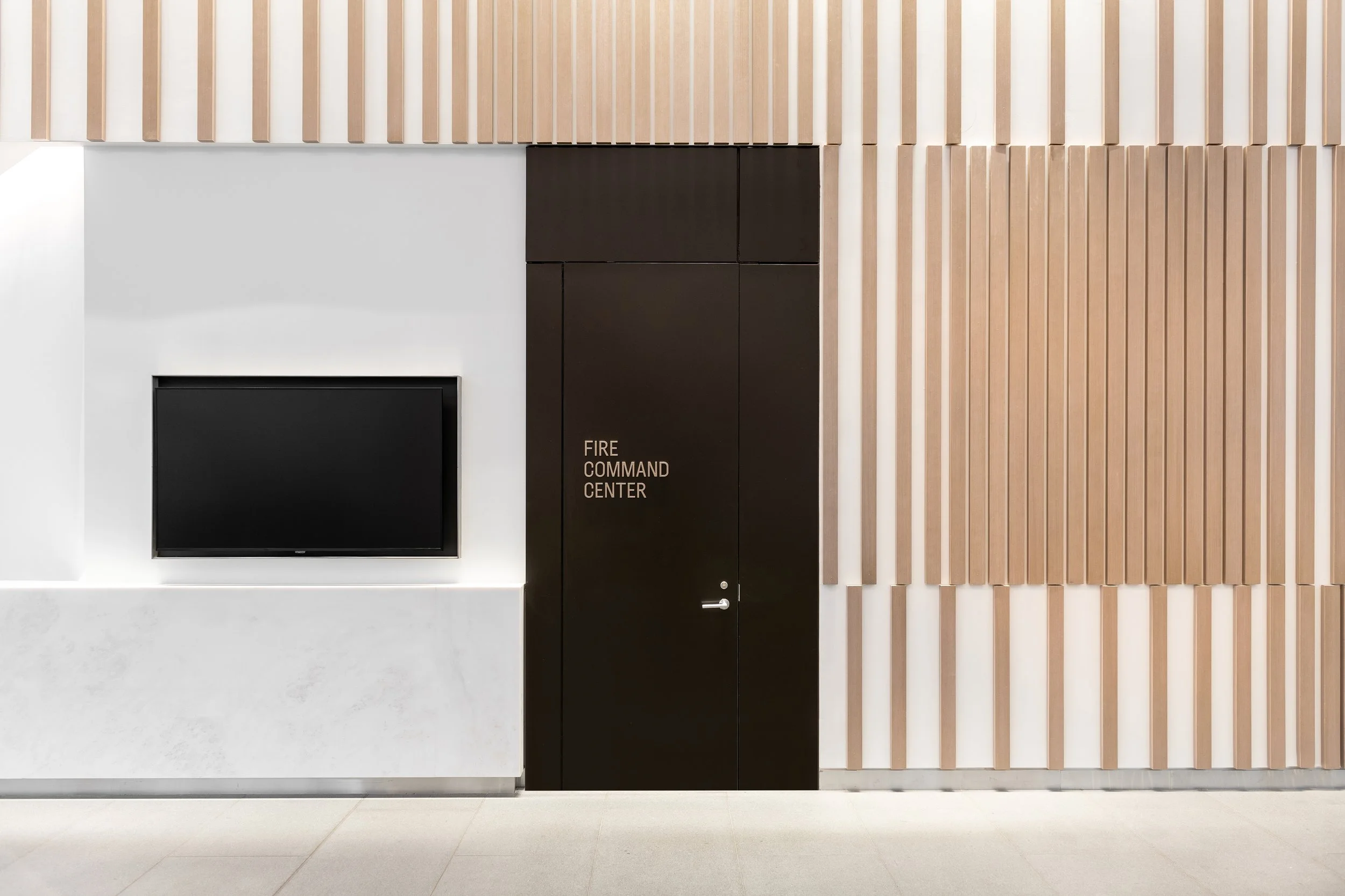
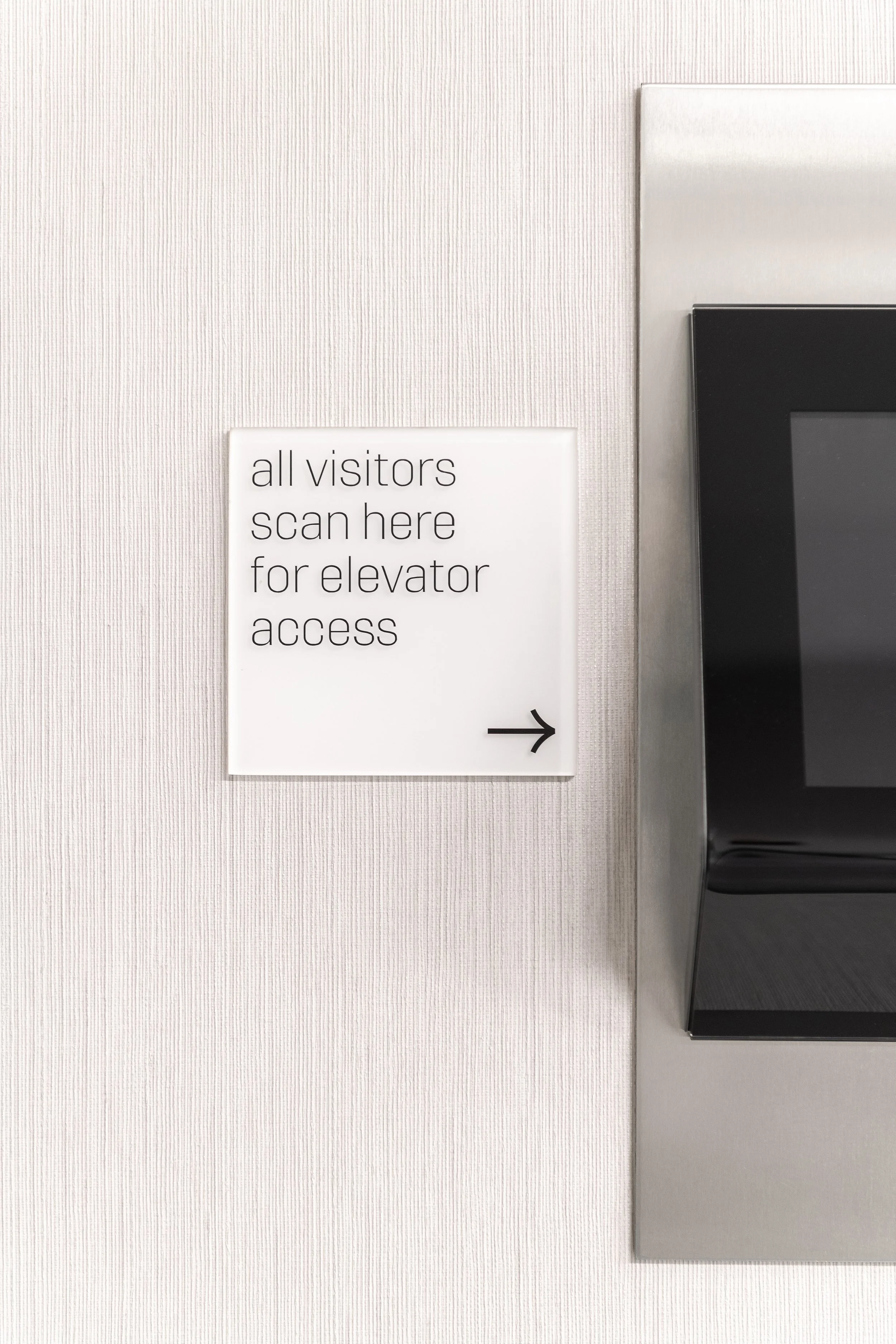
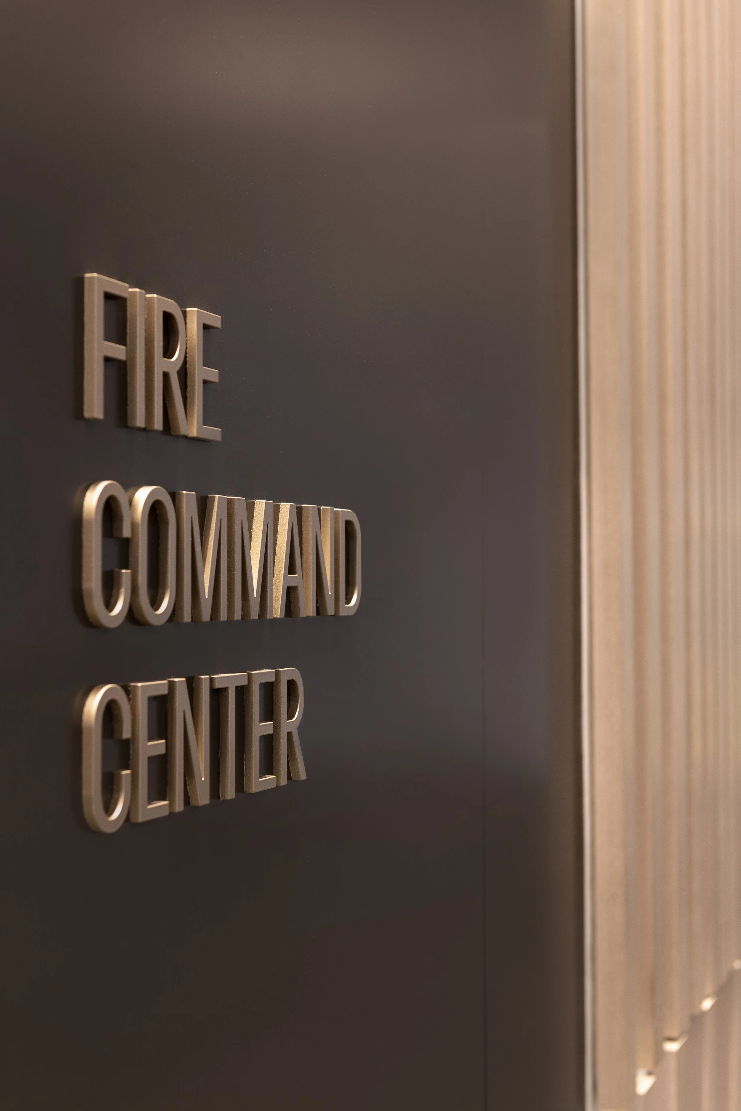
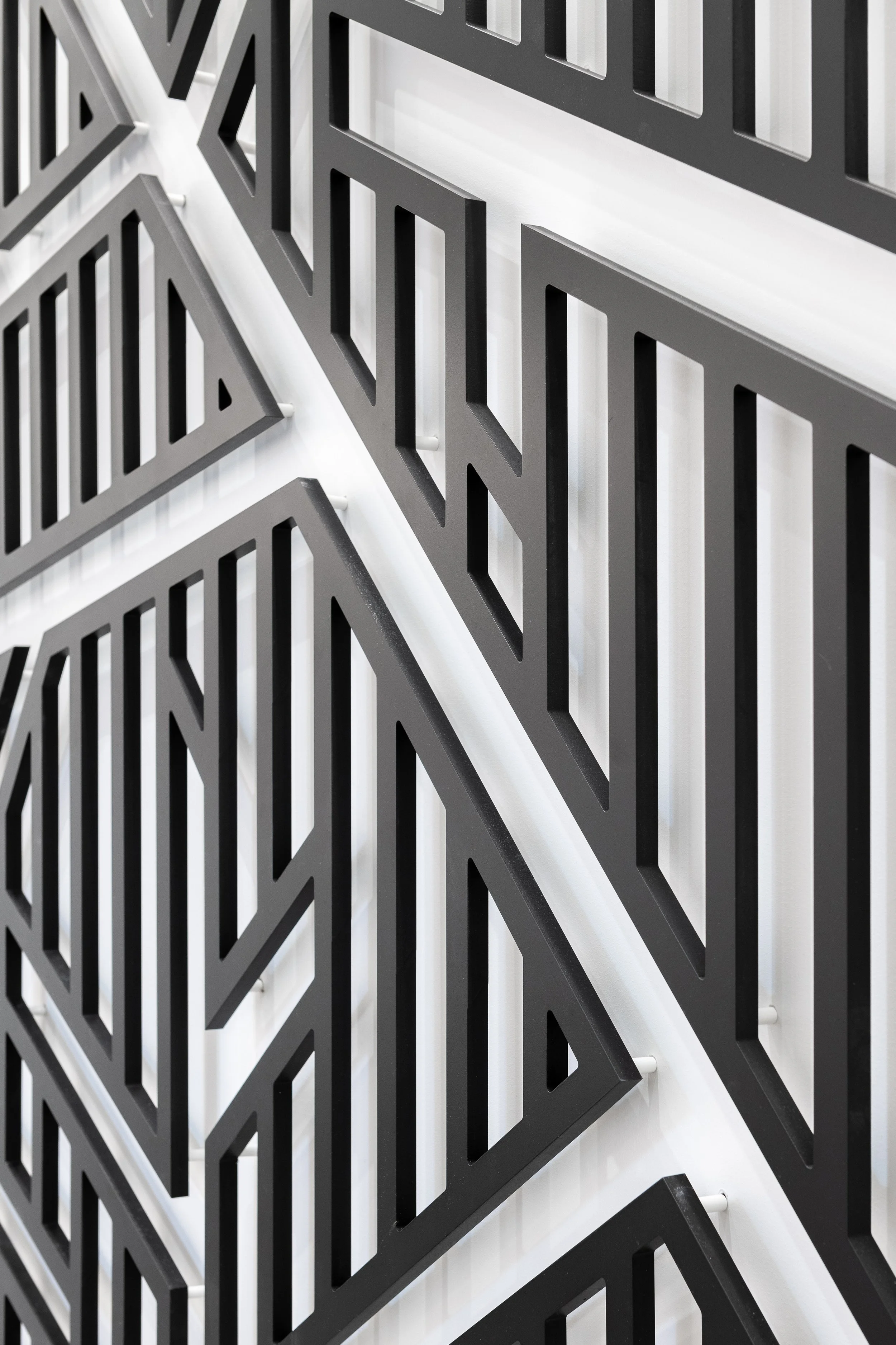
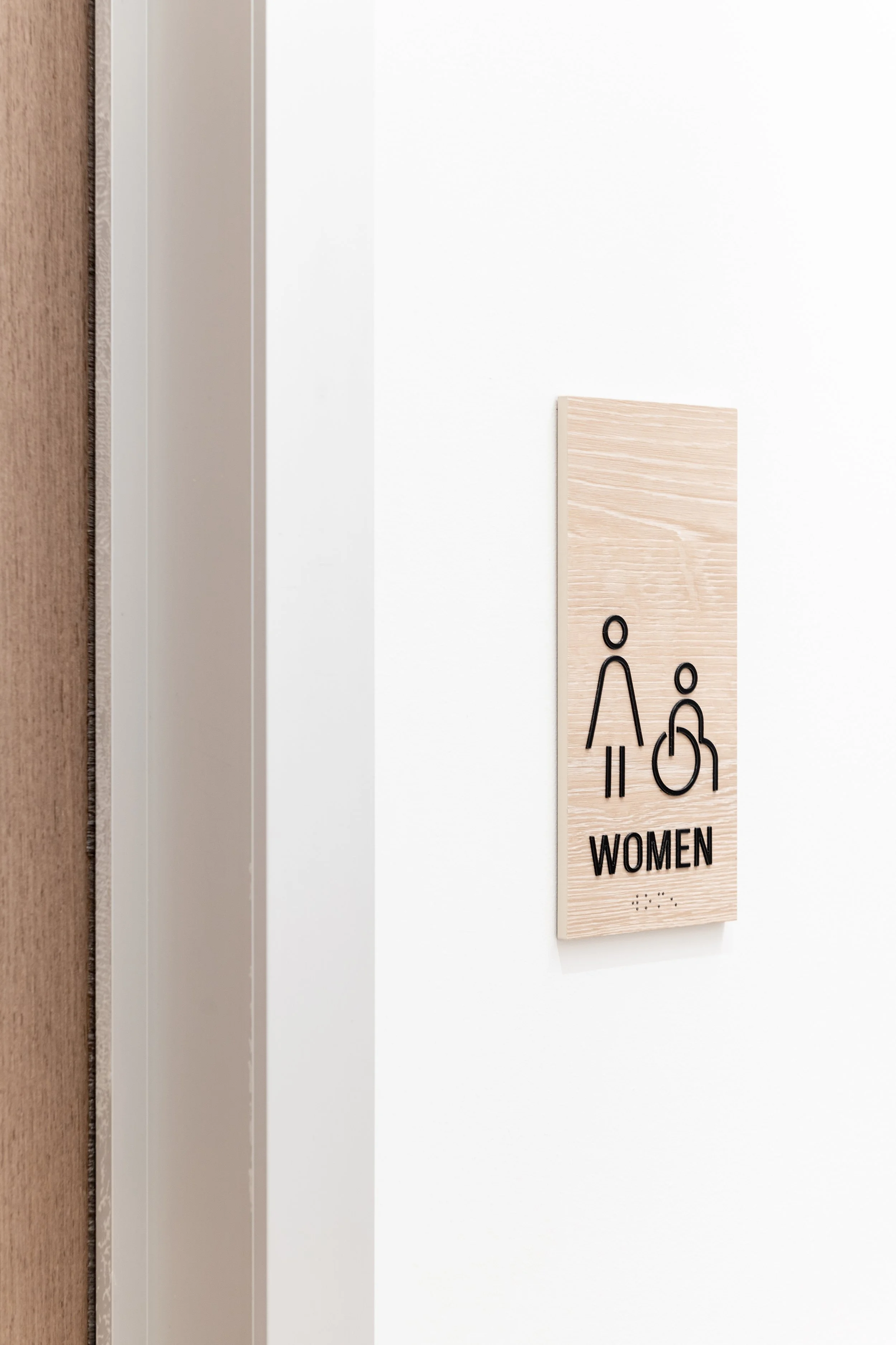
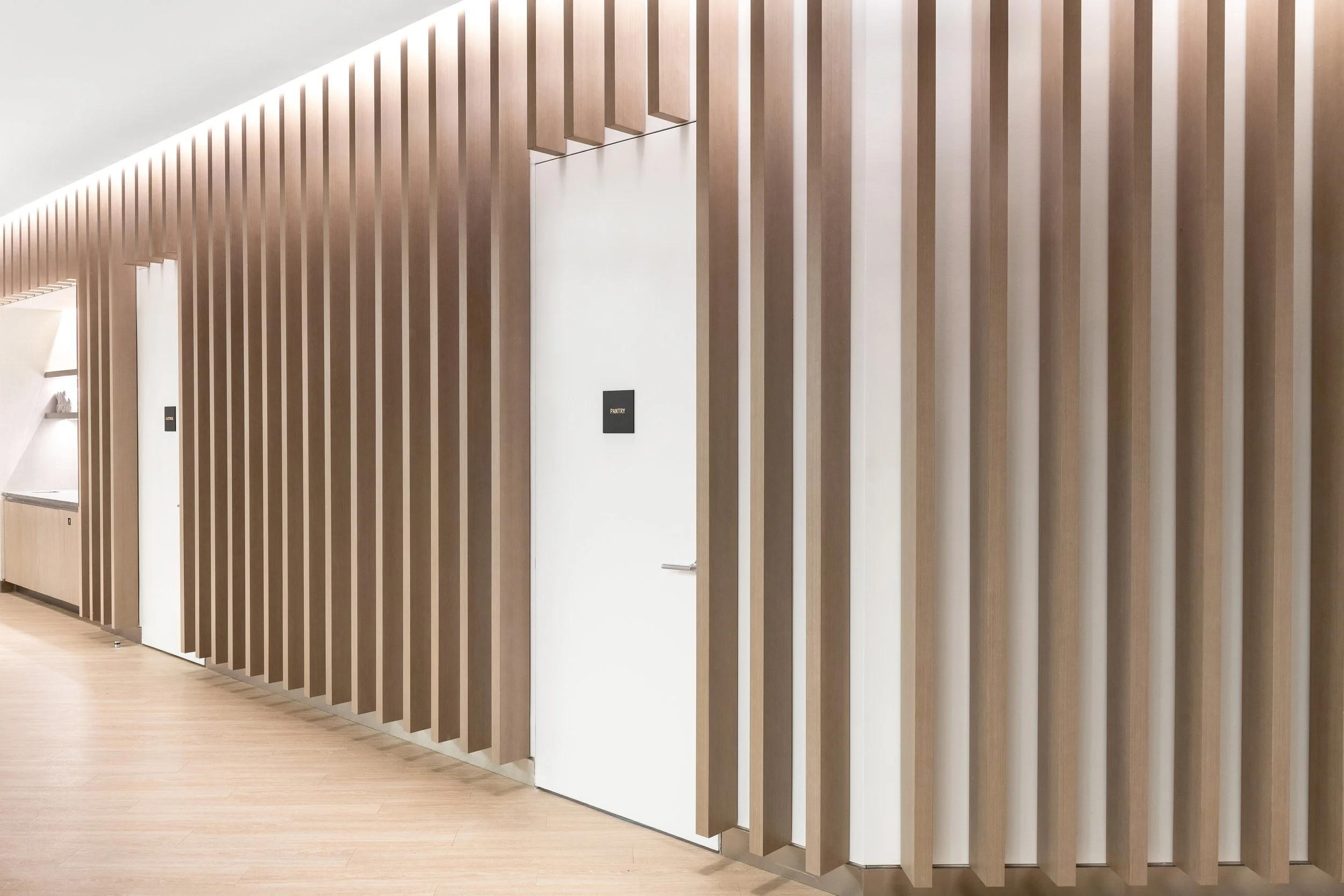
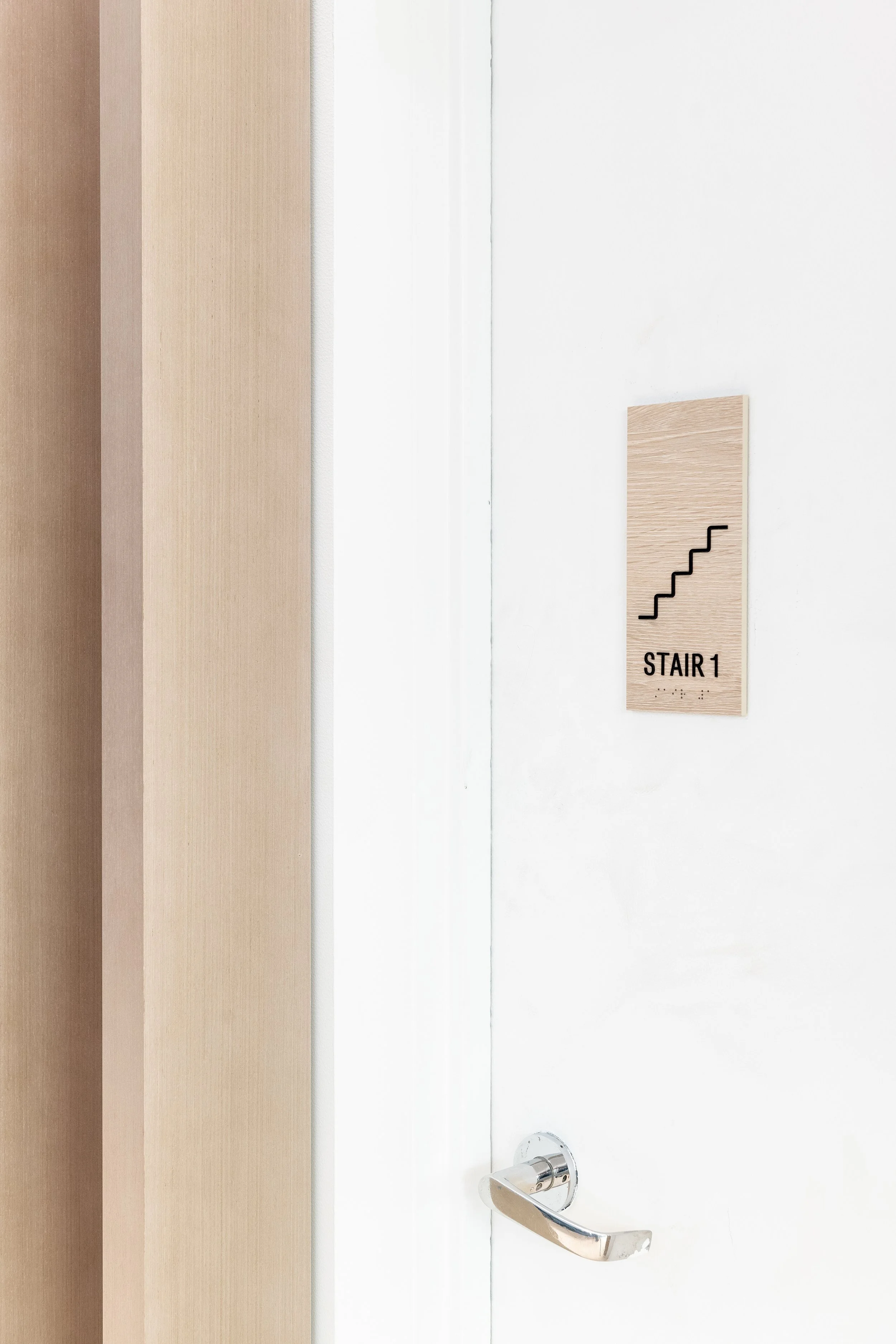
The architectural palette provides the starting point for the signage. Warm finishes, transparent glass, and clean architectural lines create a setting for dimensional typography and understated identification. Scale, contrast, and placement give information a clear presence while respecting the surrounding space.
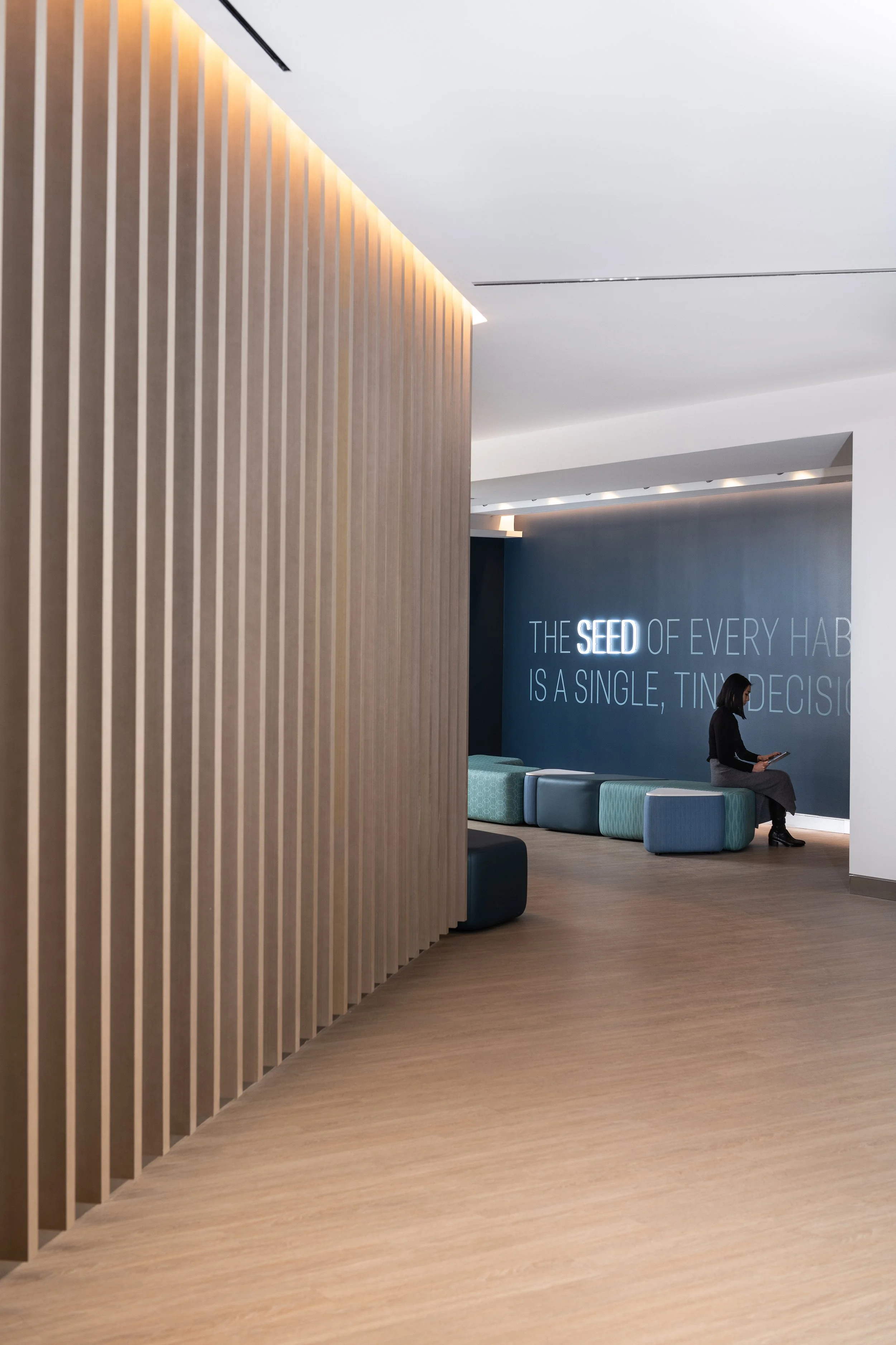
That approach continues into the upper-level amenities, where the architectural finishes echo the main lobby. A shared graphic vocabulary links conference, fitness, locker, and quiet spaces, balancing continuity with the needs of each destination. From a prominent building number to a discreet room identifier, the system brings identity and navigation into the architecture.
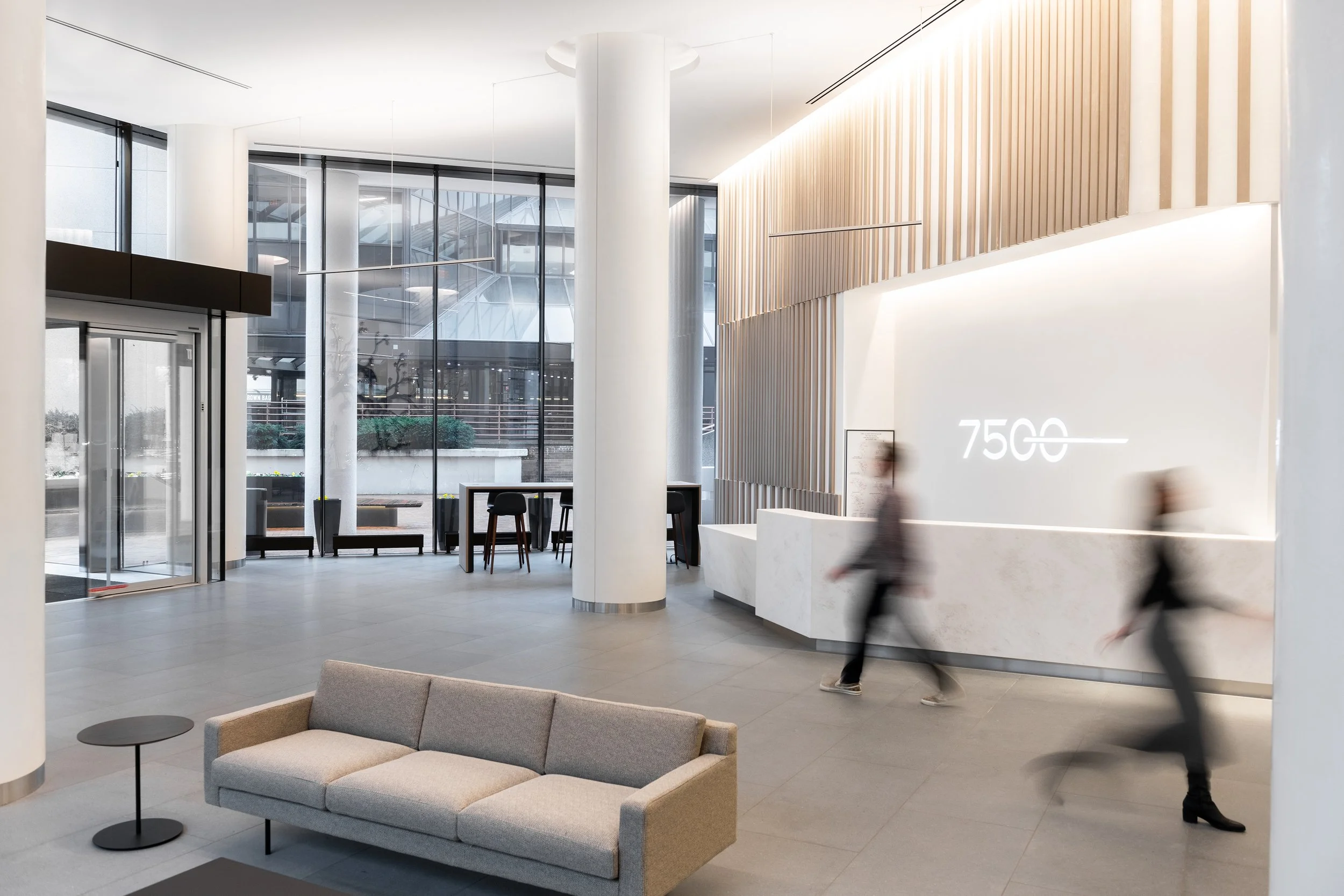
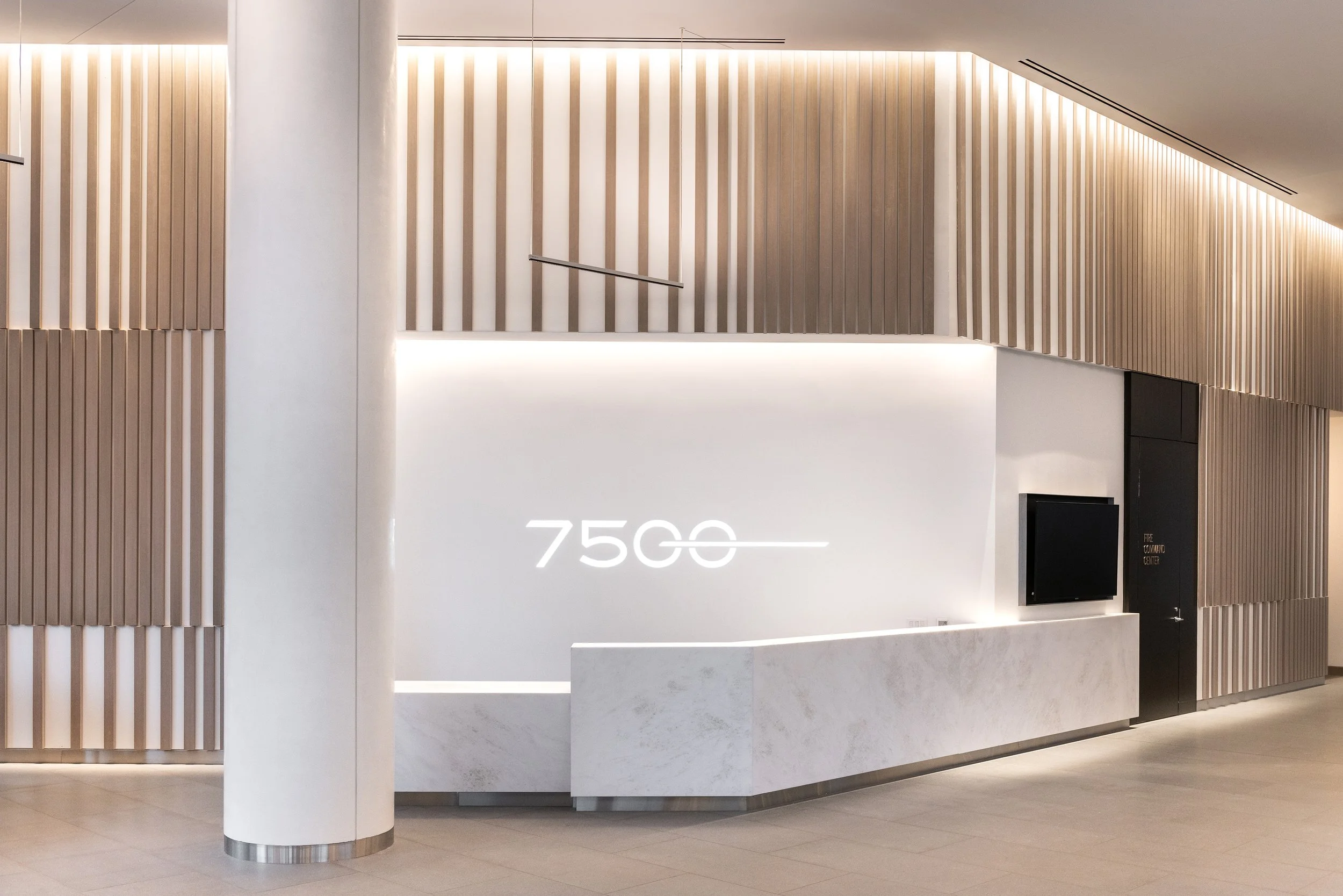
Lobby
Dimensional identification and a restrained material palette create a clear sense of arrival. Integrated with the lobby’s architectural finishes, the signage gives 7500 a distinct identity while guiding visitors through the space.

Conference spaces
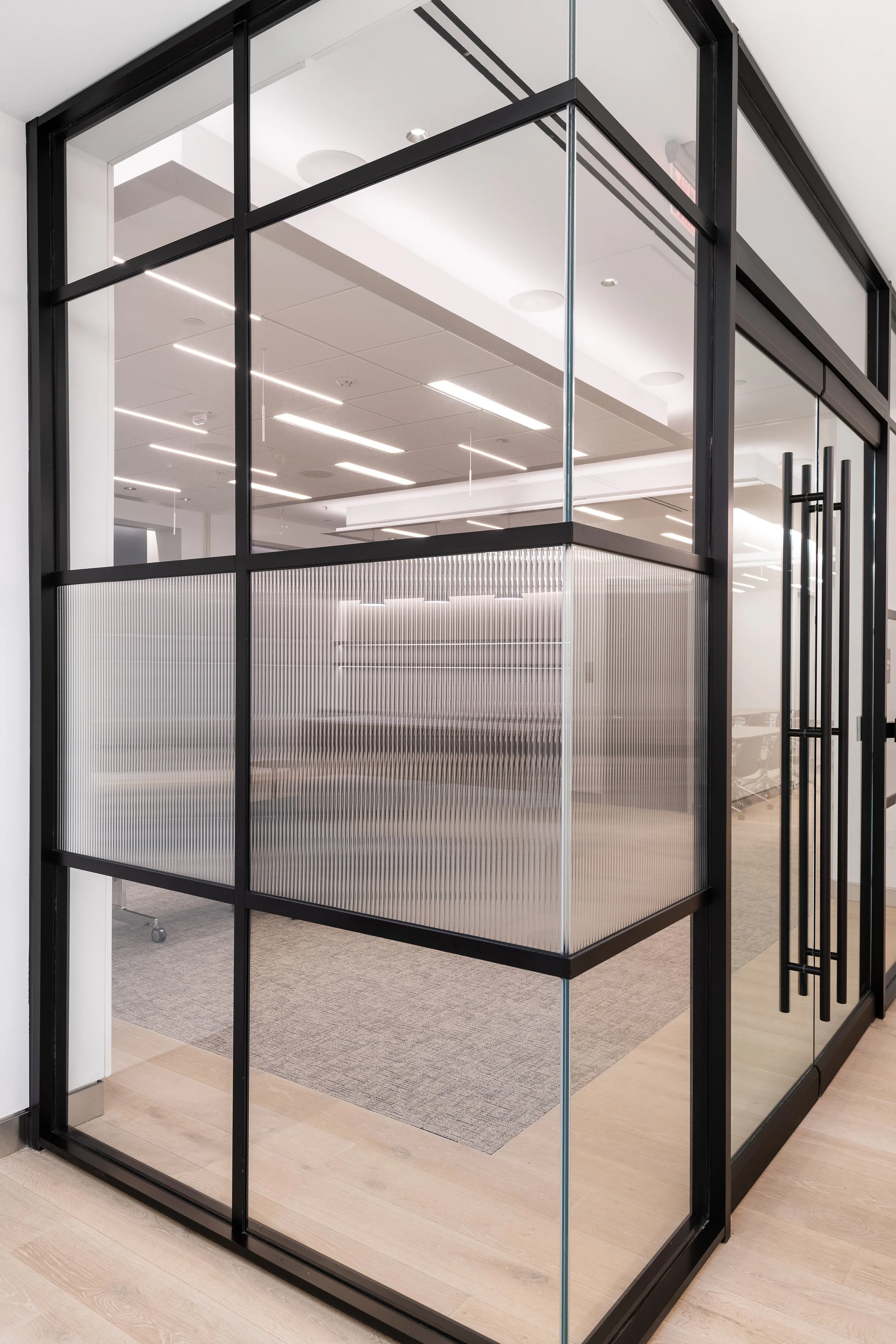
Clear room identification extends the building’s visual language into shared meeting spaces. Consistent typography and considered placement help tenants and guests find their destination with ease.
Fitness center
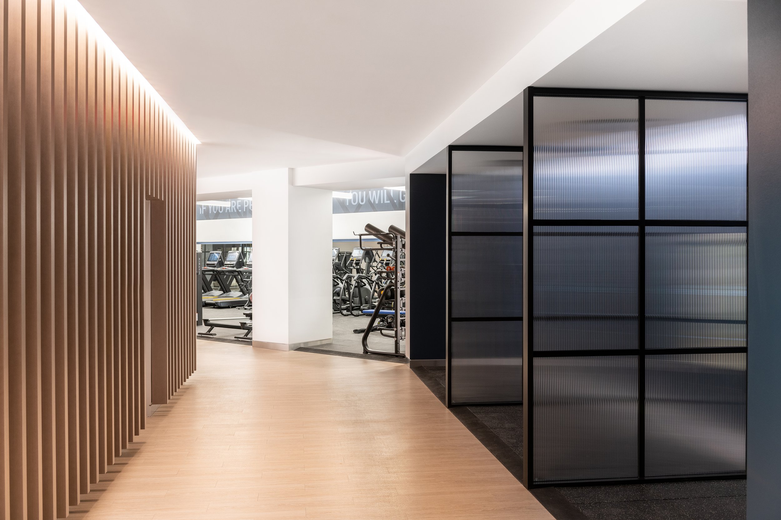
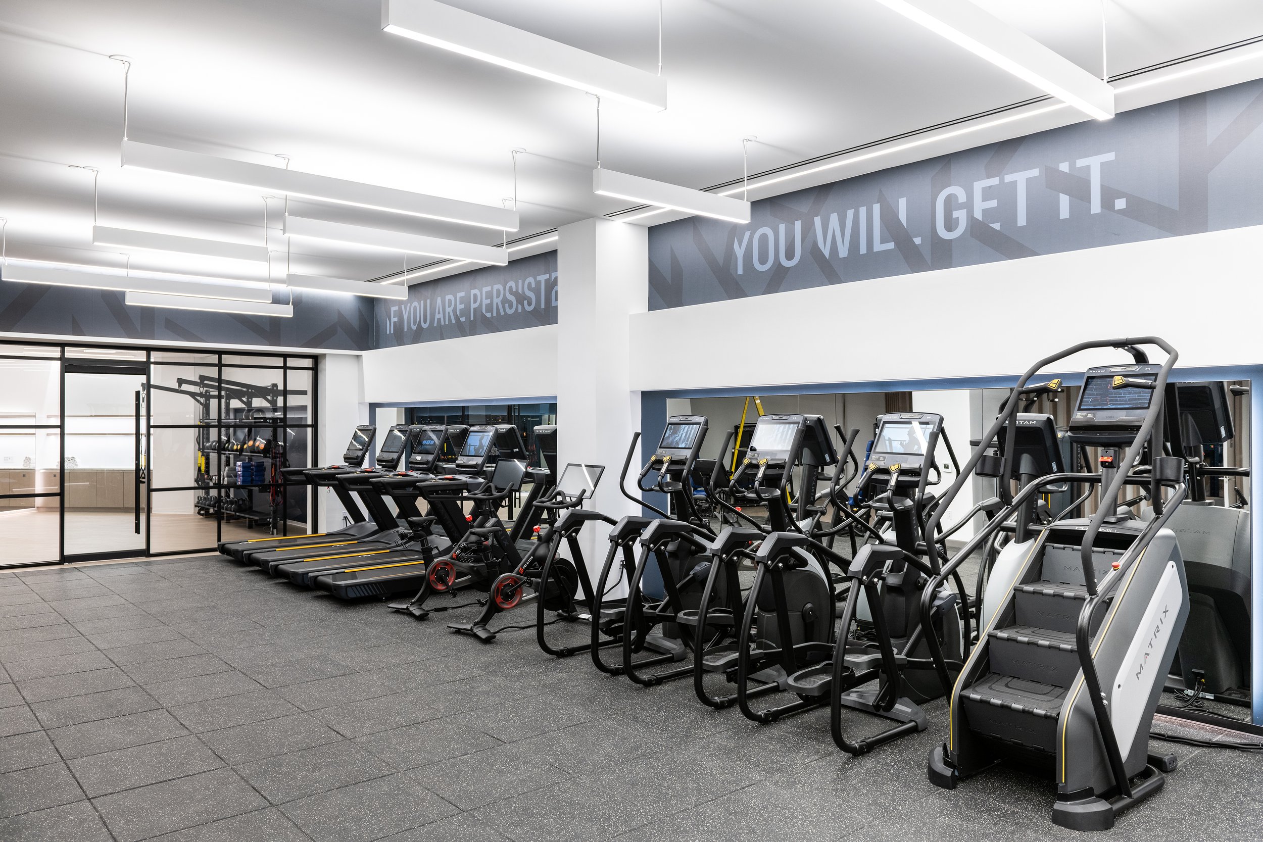
The signage system carries into the fitness center, giving this shared amenity a recognizable place within the building. Simple identification and a consistent graphic approach connect the active spaces to the broader workplace experience.
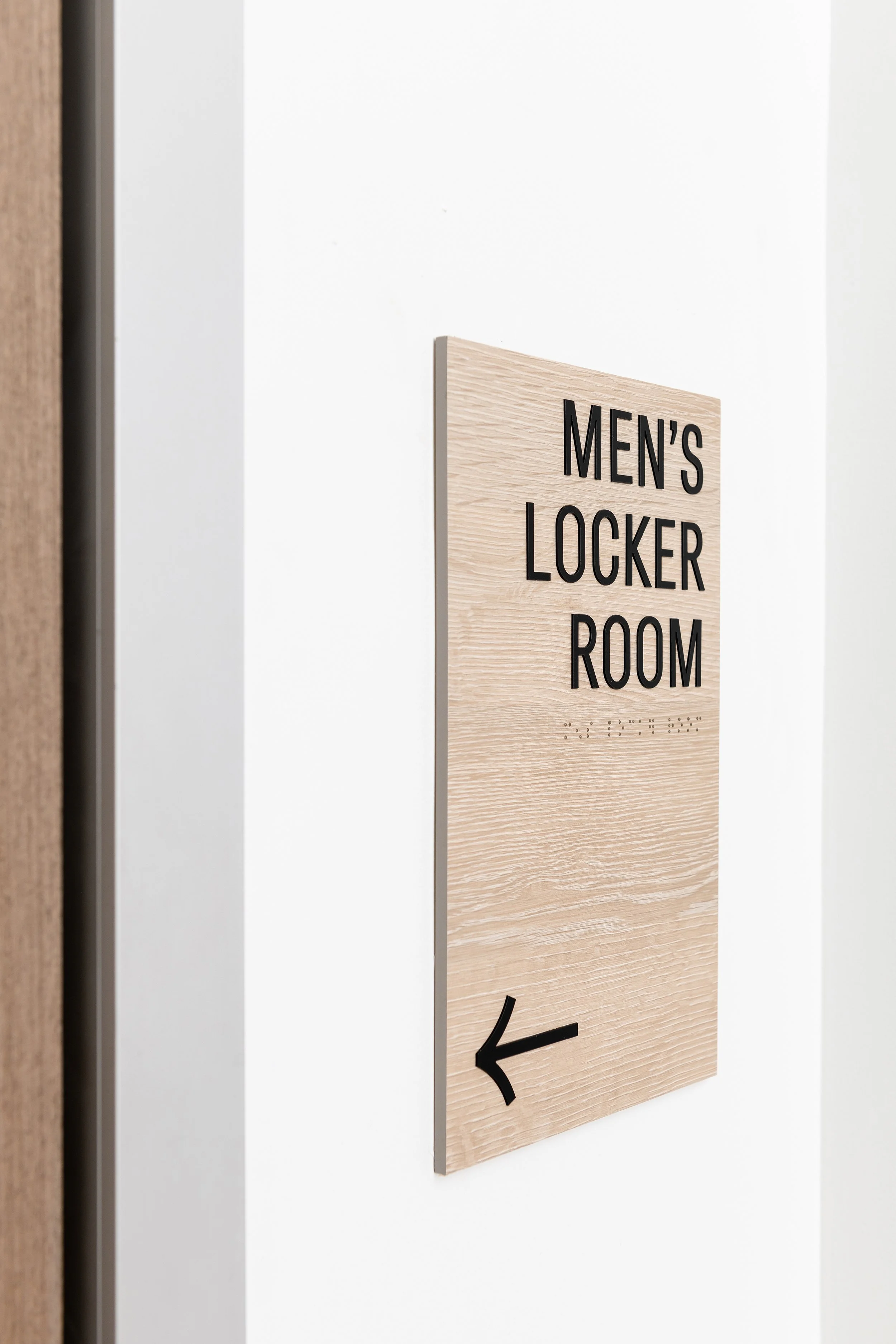
Locker rooms
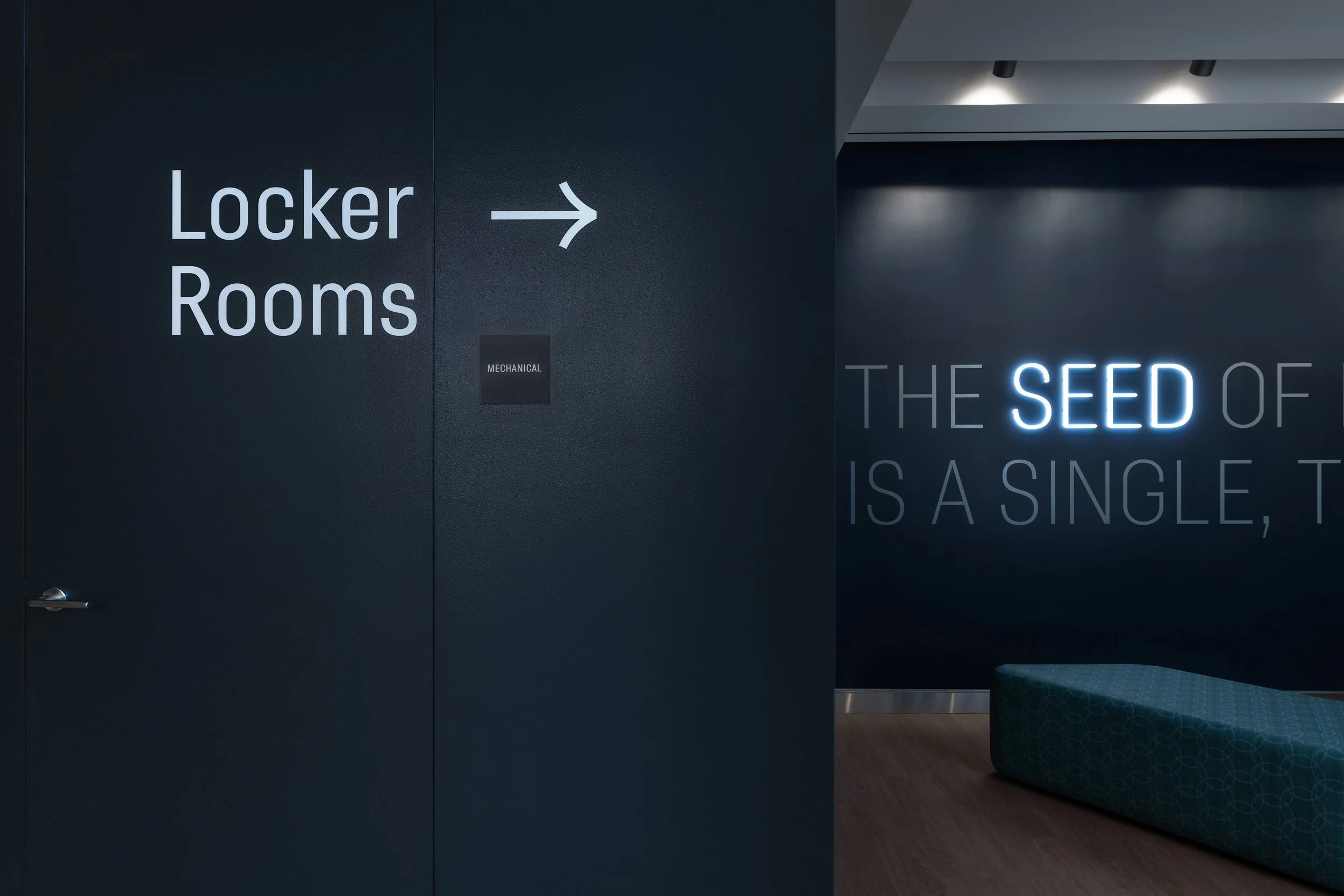
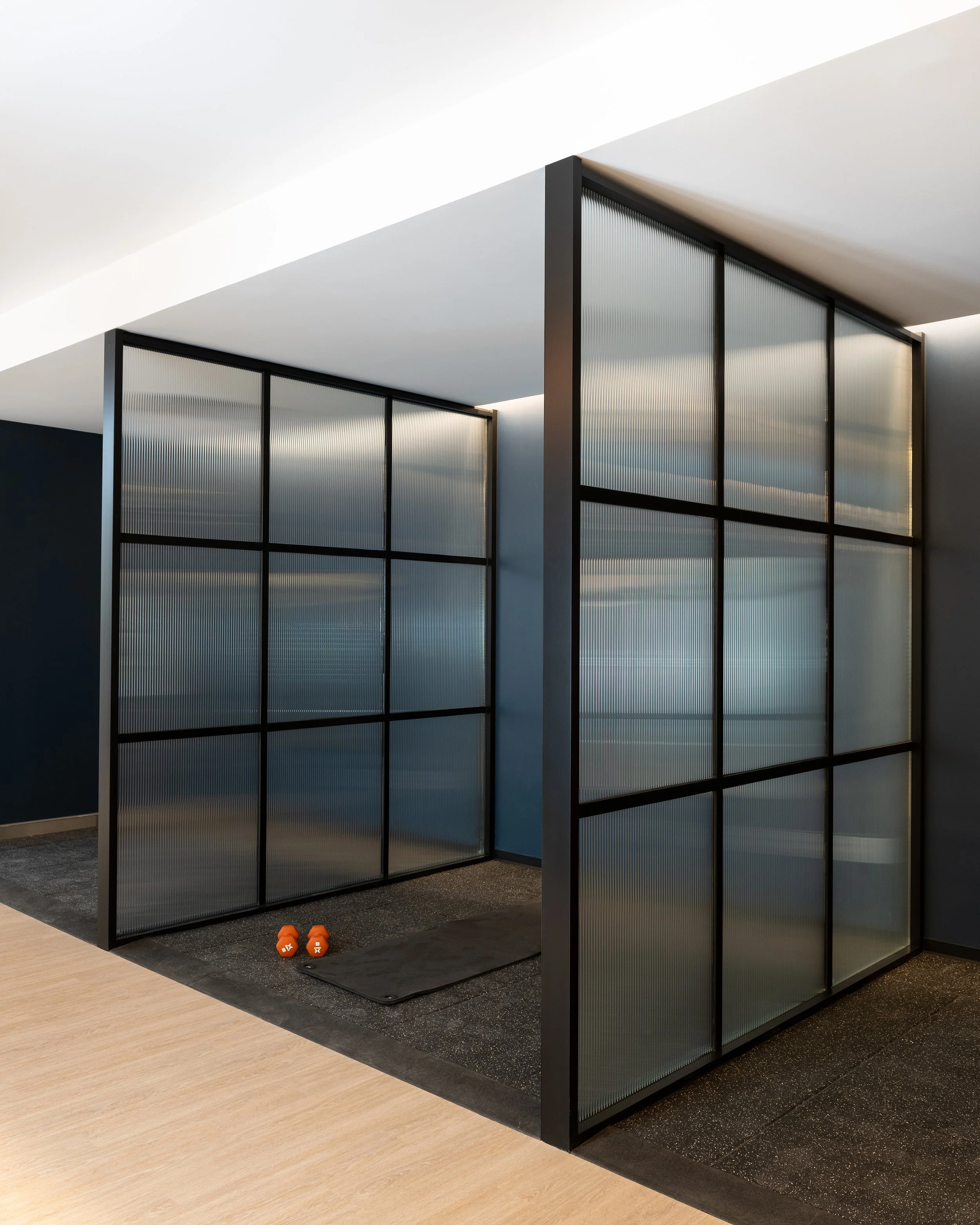
Clear identification supports the transition between fitness and changing areas. The same restrained visual language keeps these practical spaces connected to the finish and character of the building.
Quiet spaces
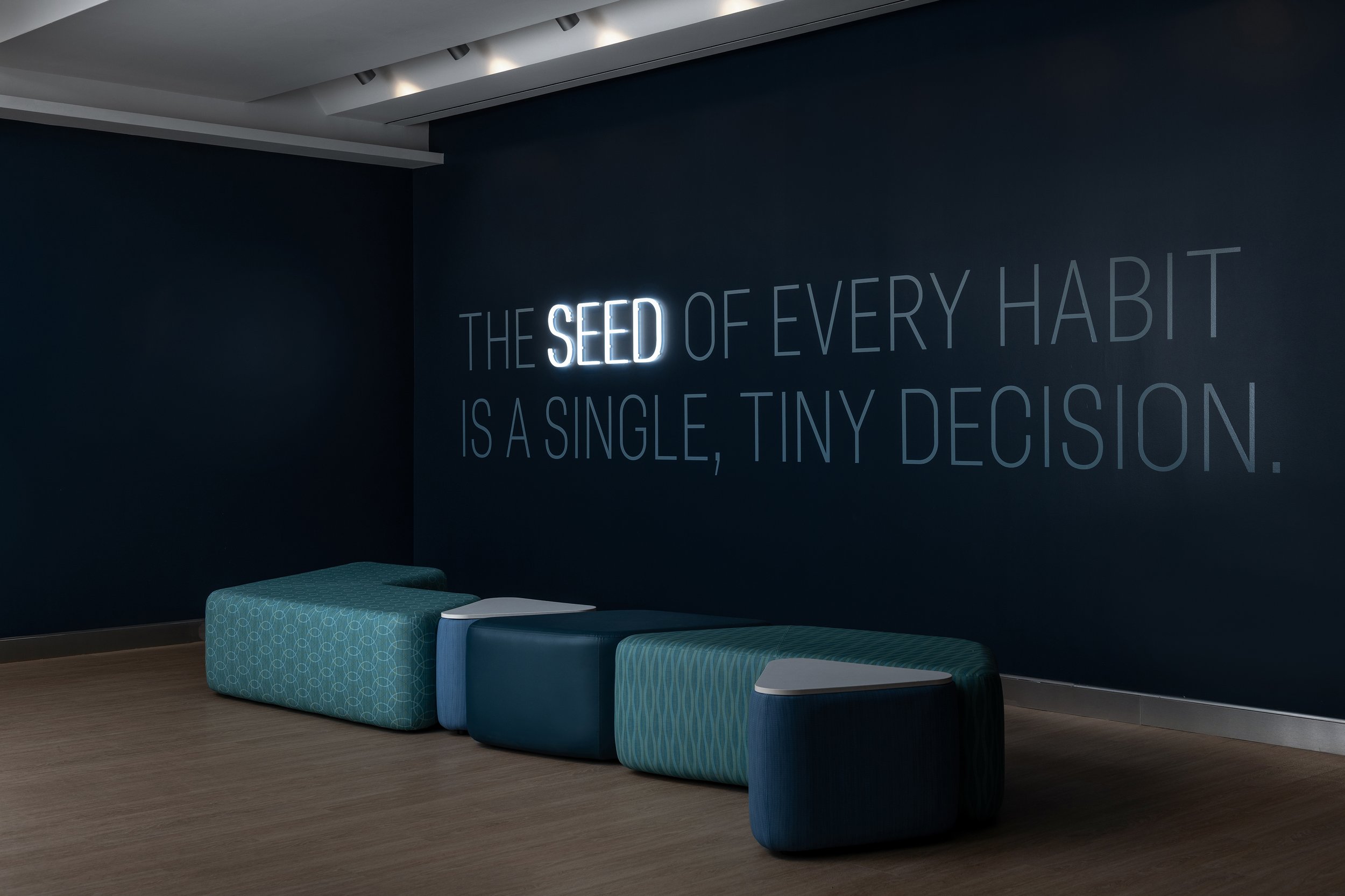
A quieter amenity calls for an equally considered graphic presence. Understated identification helps tenants locate spaces for focus and retreat while maintaining continuity with the rest of the building.